
Case Study: Redesigning for Willow Tree Mental Health
Dec 16, 2021
How can putting ourselves in our users’ shoes help them solve their deepest needs?
The Challenge:
A friend of my father-in-law approached him and asked for help redesigning their website. My father-in-law does some web developing on the side so he was happy to help his friend. He knew I had UX design training so he asked me to help him with design.
I jumped at the opportunity because I hadn’t had a ton of experience with real projects yet and working together sounded like fun.
My Role:
Lead UX/UI Designer
Timeframe:
2 months
Heading into the redesign, I aimed to keep these questions in mind:
Why would someone come to the site? What do they want to accomplish?
These are great questions to keep in mind for any kind of project. The answers to these questions will guide design decisions. For this site, I determined that there were two main reasons for people to visit:
To get therapy.
To learn about the staff and kinds of therapy offered.
With those goals in mind, I set out to make them as straightforward as possible to complete.
Initial Observations
A few things initially jumped out at me. The first thing was that there was no immediate way to get therapy or schedule a therapist. Clicking on “Services” navigated to another page with a list of the services provided and a small blurb for each one, but no option to contact a therapist or schedule an appointment.
In order to get help, the visitor would need to navigate to the “Contact” area on the top navigation, and then choose from three email addresses to send a message to. I definitely wanted to make it simpler for the user to get the help they needed.
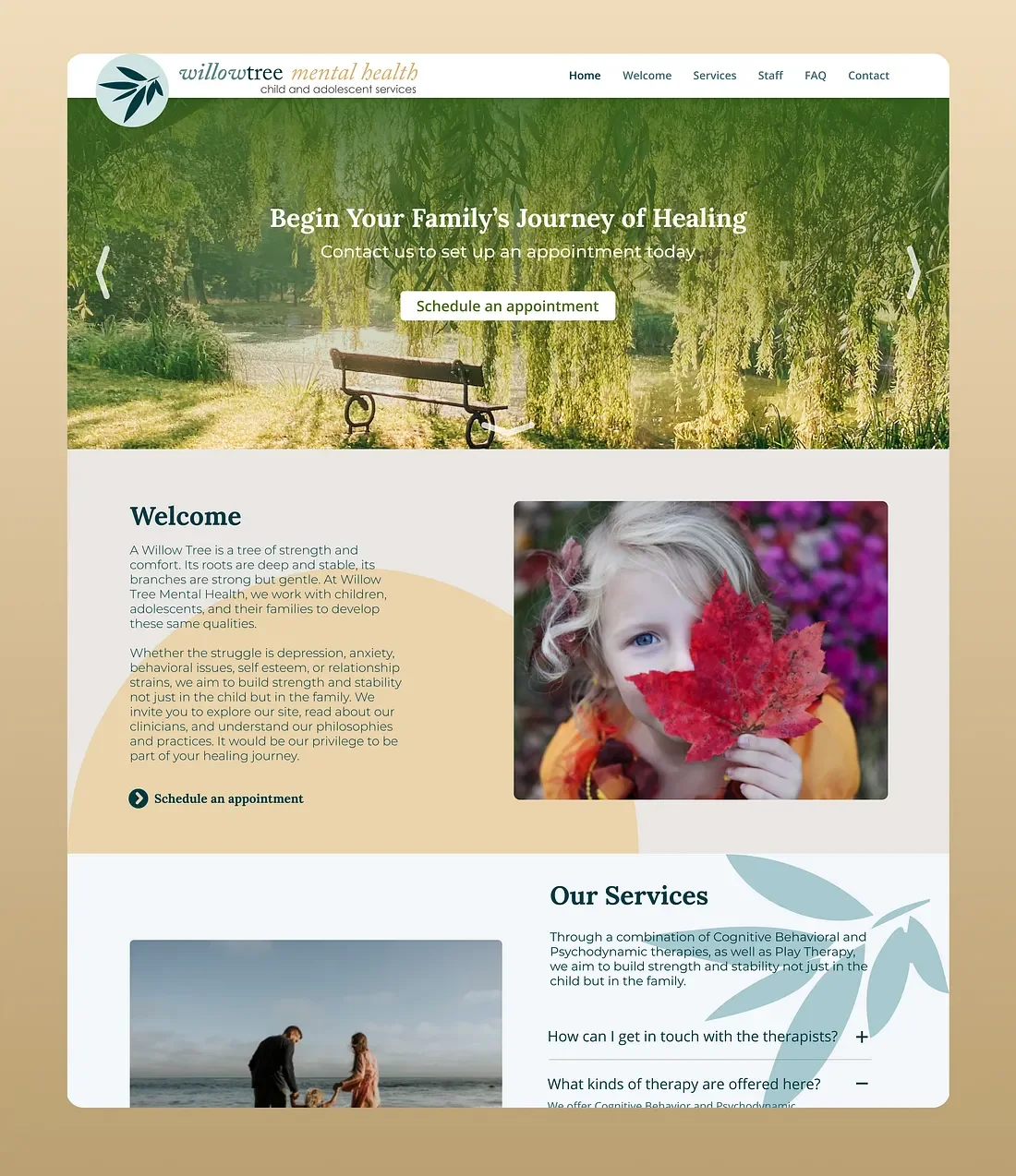
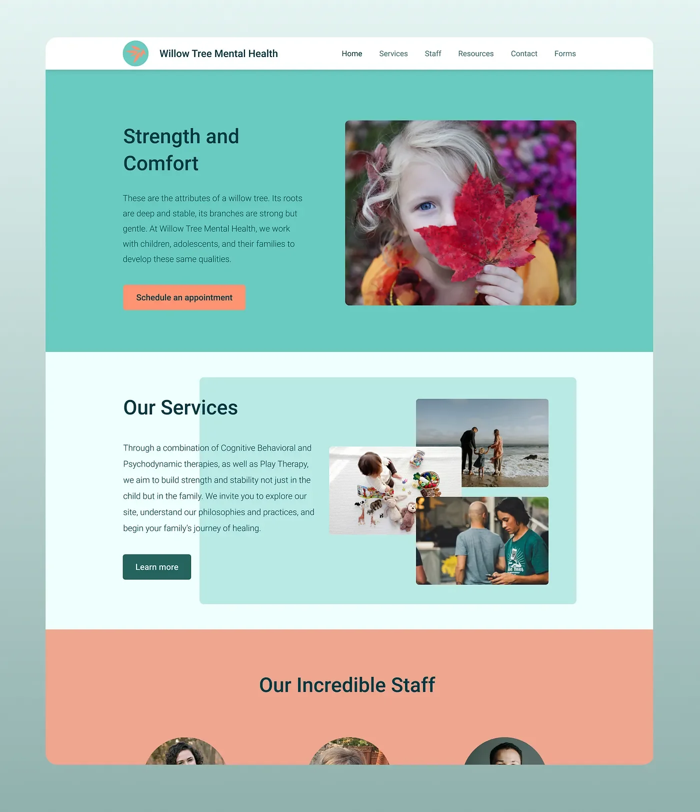
The second thing that caught my attention was that there wasn’t much on the home page. Just a paragraph, a picture, and options at the top. There’s nothing inherently wrong with that, but it does make it seem overly simple. Giving the home page some “scrollability” would make it interactive and interesting for the user to explore, as long as the important stuff is readily available.
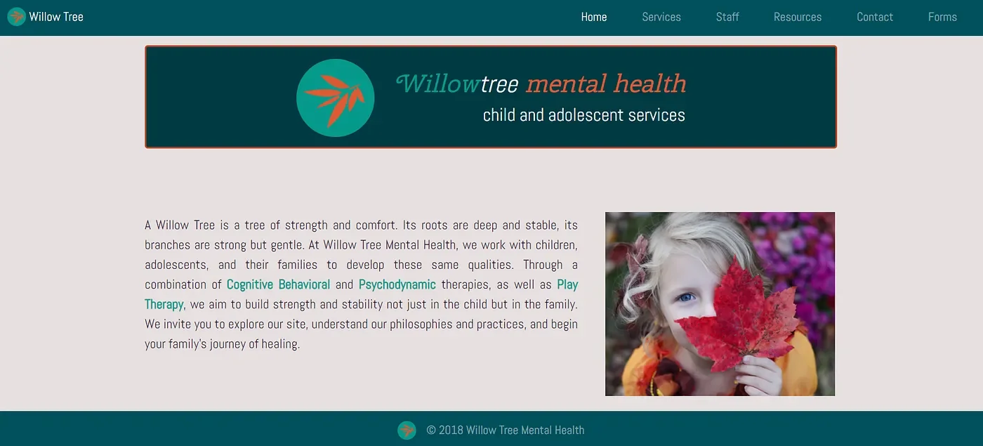
Third, the color scheme.
The orange and blue/green logo made my eyes hurt and triggered my fight or flight response.
I would have to change this if the site owner was up for switching their original color scheme.

I used Figma to create and prototype the designs. I stayed near the color scheme at first because I wasn’t quite sure if the site owner wanted to keep it that way or not.
In hindsight, I should’ve just asked at the beginning!
Ideation Phase
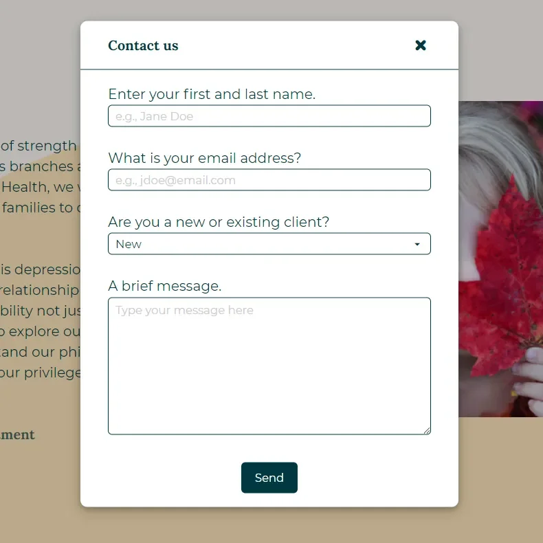
To help with user goal #1 (I want to get therapy), we needed to provide the user with a clear direction on how to contact the therapists or schedule an appointment.
The clearest way to put that front and center would be to include a call-to-action that the user could tap or click to quickly get in contact with a therapist.
Clicking on the link would open a form modal with options to enter a name, email address, client status and a brief message.
Clicking “Send” would then send the message to the selected therapist. In the cases of a new client, it would be sent to the head therapist to coordinate.
First Draft
I prototyped the initial “get help” flow in Figma.
The first draft of the new site met the goal by having a straightforward way to get therapy.
The color scheme still wasn’t very easy on the eyes and the site looked empty. This was the first site prototype that the developer and I showed to the site owner. They liked that there was a button to schedule an appointment and the site was more interactive, but they wanted it to be more visually interesting.
I was so happy to hear that the site owner wanted a different color scheme as well!
Visual Design Research
Now to make it visually interesting. I won’t pretend that I’m a graphic designer or illustrator. To make it look nicer would stretch me a bit, but I was excited to learn!
I did a quick Google search for “calming color schemes” and found a nice one that I ended up sticking with. I also did some research into font pairs and chose the serif typeface Lora (for the headings) and the sans serif Montserrat (for body text).
After checking into some similar sites for inspiration, I also added a hero image at the top, with copy headlines given to me by the site owner. I added in a couple of accents to add something to the empty spaces and it turned out fairly well!
Through it all, the new design focused on the ease of scheduling therapy-- our first user goal.
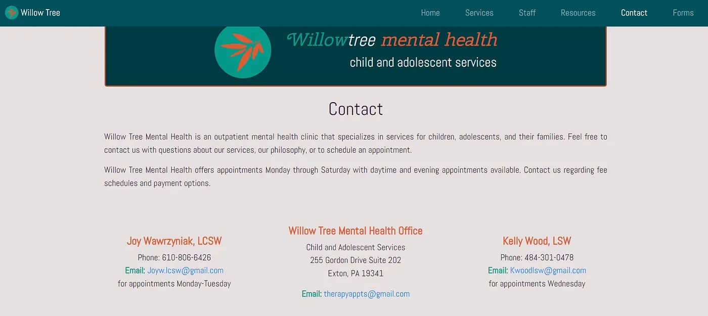
User Goal #2
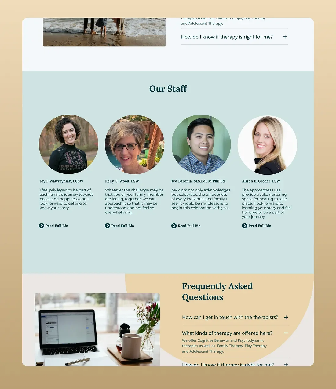
I want to learn more about the staff and kinds of therapy offered.
The current site was doing pretty well with this. The top navigation sections were clearly labeled and the user could get that information fairly intuitively. I wanted to keep that element of simplicity in the redesign.
By including the option to see the staff and learn more about them, as well as including a section of frequently asked questions, the end user would be able to do any research necessary to make an informed decision before committing to therapy.
Giving the user this information could potentially lower any anxiety or barriers to getting therapy.
Conclusion
Check it out! The updated site is live and working at http://www.willowtreementalhealth.com/
It was so exciting to build something real for an actual business!
Takeaways
If I had more time, I would have liked to do some more user research. I would’ve liked to identify people who regularly attend therapy and/or schedule their therapy online and identify any pain points in the therapy processes. I would’ve also liked to find people who are browsing therapy sites and ask them what factors make them choose one practice over another.
Thanks for taking the time to check out my case study! Hopefully you have learned something about me or my process. Please send me any questions or feedback. I don’t know everything and I’m always excited to learn something new.